
Colour Combination Examples For Your Living Room
Vivid greens, bright blues, purples and metallic grays are very trendy this season, and can often be seen in home decor products.
Of course, we don’t have the luxury of refreshing our living rooms with new and fashionable colours each season. That’s why we recommend simpler and more cost effective solutions, such as changing furniture or upholstery in your living room. Major changes such as renovating a fireplace or windows can be radical and costly.
Low cost changes to your living room can easily be made, for example, re-painting the walls in different colours, changing the curtains or using new pillowcases. You can also add a few new items of furniture or accessories to the room in a trendy yet natural colour scheme. If you choose well when buying new items, you’ll get many years of use from them.
10 Inspiring Ways To Decorate Your Bathroom Using Monochrome Like a Pro >
Wallpaper - A ‘How To’ Guide To Choosing, Removing and Pasting >

Let’s take a look at some living rooms that are designed with wonderful colour combinations, and see what the colours are inspired by:


For me, gray is synonymous with simplicity these days. I believe that gray has a more vivid and clean appearance when compared to beige, which is a common colour choice in living rooms. I like to combine gray with light warm colours such as a woody brown or yellowish greens like in the picture. I recently designed a room using many different shades of gray ranging from light to dark, and the outcome was lovely and original. You can also combine grays with pretty much any other colour (even beige).
Here are some sample colours you can use for a similar look.


I know I already mentioned i prefer natural colours for furniture, but there is something so attractive about those purple armchairs - I really love them! Have you noticed how the purple is the only striking colour in this room? If the room featured green walls and a blue sofa as well as the purple armchairs, it would be overdone.
If you do happen to come across and fall in love with an item of furniture in a vibrant colour, don’t hesitate to buy it. You might need to adjust the colours of other items and accessories in the room though, to complement the new item and to draw attention to it.
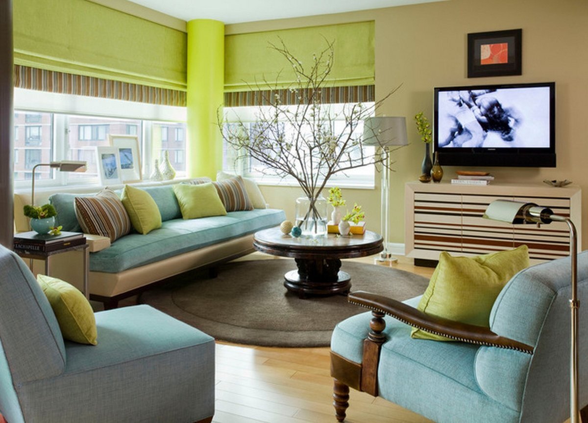

I like the combination of blue and green, especially the harmony of water blue with a bright green. I think the colours suit each other very well. Despite both being cool colours, they create a pleasant and inviting atmosphere when combined. This might be because the green and blue evoke nature, sea and sky.
If you’re interested in painting your home, you can get a free quote from the best painters with HomeRun.


You may think green and red would be difficult colours to use together. They’re opposing colours in the spectrum, that is to say one contrasts the other. One way to soften the contrast is to avoid using a dark shade in one of the colours.
The wall in this picture is completely green, but a lighter shade of green has been used. The red on the other hand is a darker and more pronounced cherry shade, again a more natural colour. Also, because the contrasting colours are applied to different objects and surfaces (wall paint and furniture) they don’t clash. This unexpected colour combination is a great choice for a modern living room.


Those of us who love open, wide and breezy areas shouldn’t make the mistake of using just shades of whites for all walls, ceilings and furniture. Using splashes of vibrant colour will actually add space to the room.
You can add nice and vibrant colours without overdoing it. Here, for example, is a nice harmony of black, bright orange and light blue. It’s another example of using two opposing colours in the spectrum (blue and orange). A really beautiful balance is achieved because a light shade of blue had been opted for.
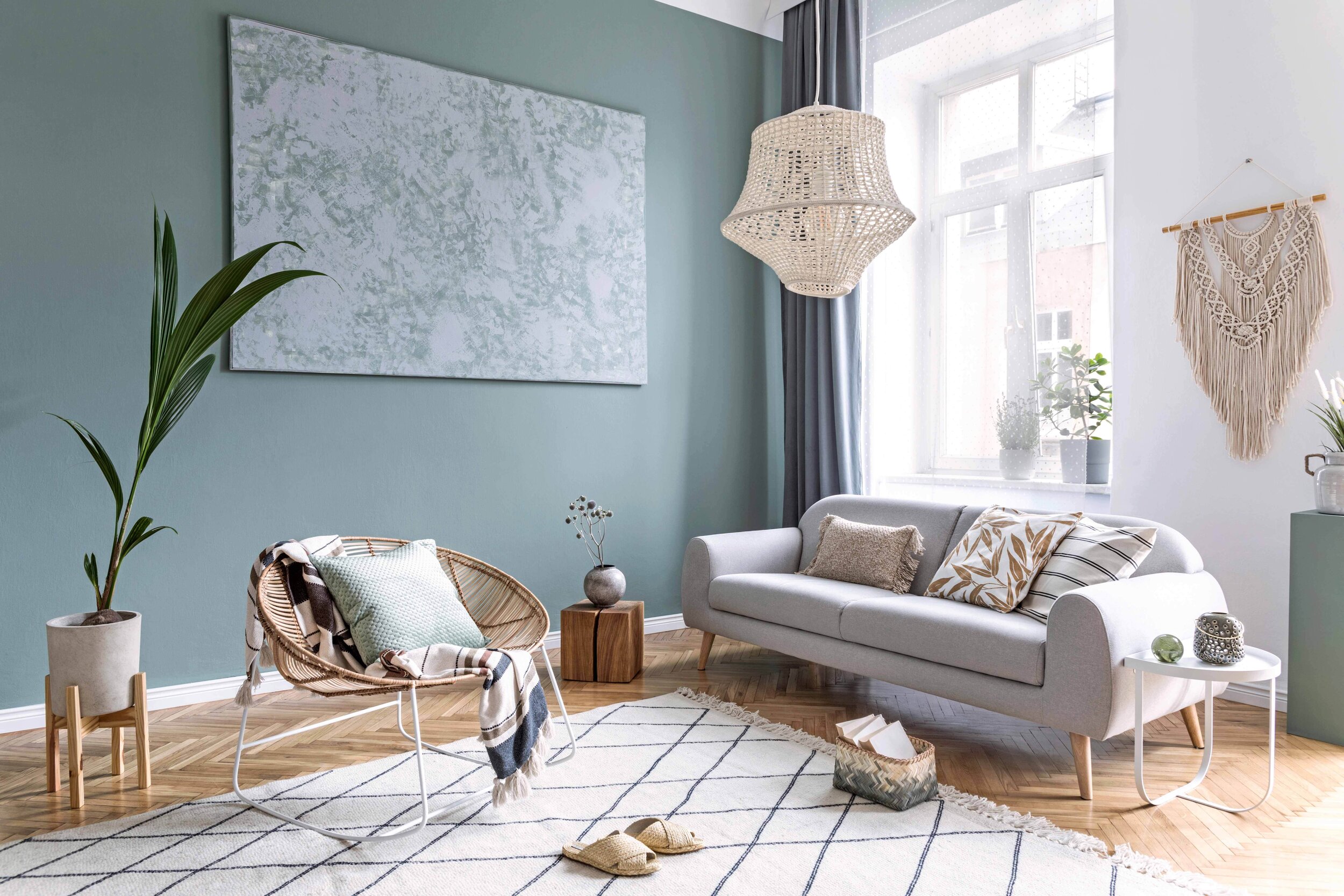

Generally speaking I prefer vibrant colours, however I do really like the soft look of this room. Sometimes very vivid colours can actually dim other elements in a room like a piece of art, furniture, accessories or a beautiful view. This living room looks bright, airy and inviting. Dark details are scattered throughout. This is an excellent example for those preferring light and natural colours. A pleasant and peaceful living room is created by wonderful blends of light gray, greens and blues.


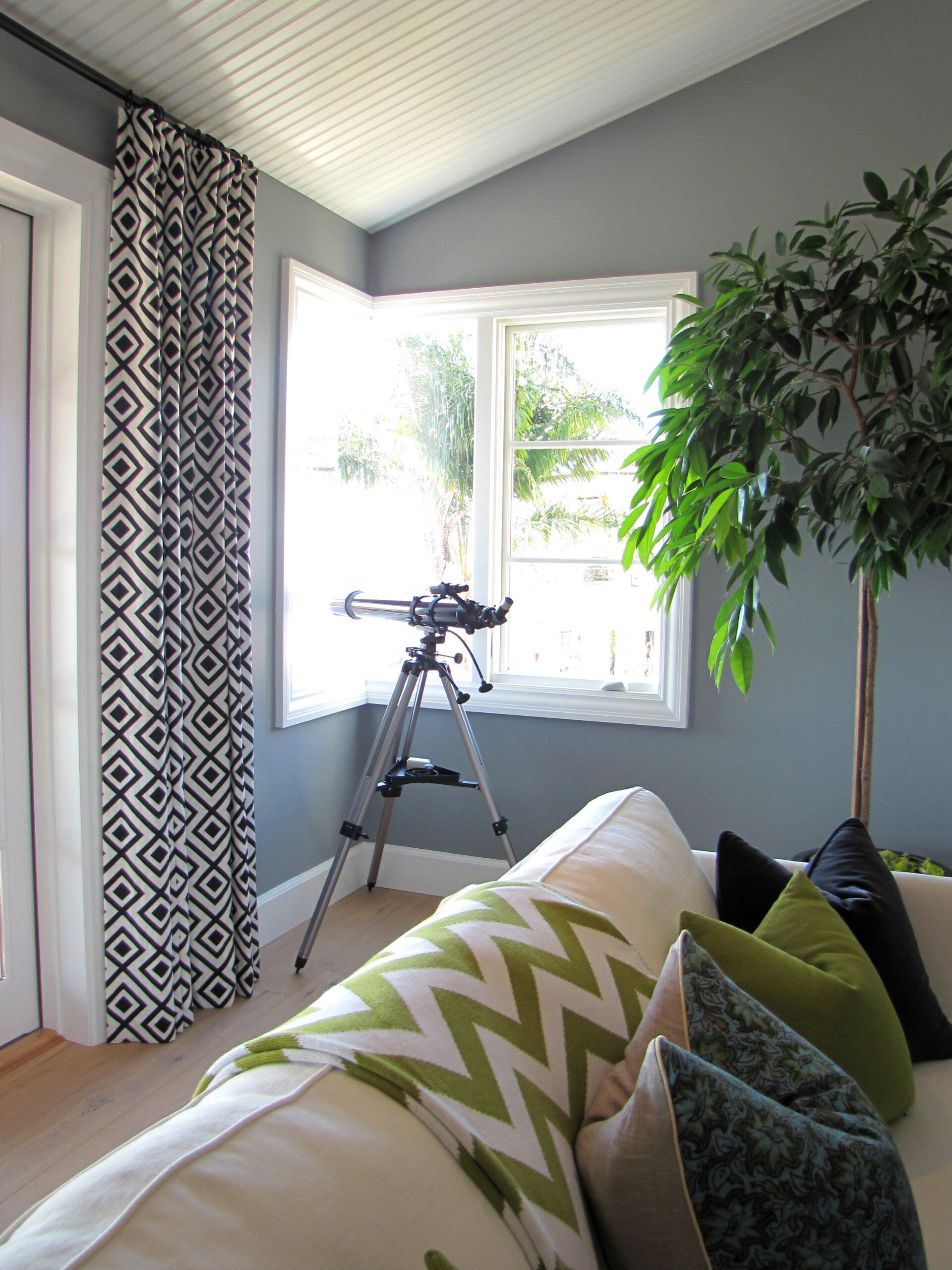
As well as using more grays, I'm increasingly using more dark blue too. It’s much softer than black but gives the same intensity and is very harmonious with other colors. Here’s an extremely successful colour trio using light gray, olive greens and blues.

Revel in the colours from this picture! As the bright colours here are provided by the paint on the furniture and the curtains, it makes it really simple to switch to different colour palettes in the future.


Source: Houzz


